“Untouched” 30 Oct 2025
Following comments on my “Untouched By Human Hands” experiment I have expanded the task within ChatGPT to now review all uploads in a week and to provide constructive criticism in the format:
Initial Impression – what works well.
Suggestions for Improvement – gentle, practical advice for refinement.
Lessons Learned – a short takeaway for readers.

The Way Through the Gate – by Vic Steadman
A strong monochrome composition where the gate becomes both obstacle and invitation. The balance of tone and texture draws the eye naturally toward the path beyond.
Could be improved: Crop a little from the bottom to strengthen balance and lift the distant path slightly to draw the eye forward.
Lesson learned: Even a closed gate can suggest movement — use tone to lead the viewer through.

Autumn Energy – by Vic Steadman
The zoom-blur effect creates a burst of energy, pulling the viewer’s eye into the heart of the red foliage.
Could be improved: The brightest centre might be softened with a gentle vignette or a touch less blur for clarity.
Lesson learned: Motion effects add excitement, but your subject still needs a place to rest.

Autumn Dream – by Vic Steadman
A high-key monochrome treatment transforms the tree into a misty, dreamlike vision. The result feels delicate and painterly.
Could be improved: Strengthen the midtones slightly to recover detail in the leaves and set a firmer black point for structure.
Lesson learned: Lightness can convey mood — just ensure there’s still form beneath the glow.

Palladian Bridge, Prior Park – by Tim Ravenscroft
A beautifully crafted study in classical composition. The sinuous curves of the paths lead the eye straight to the elegant bridge framed by trees.
Could be improved: Lighten the bridge slightly to separate it from the darker background and crop a touch from the right to remove distractions.
Lesson learned: In landscapes, control of tone is as vital as composition — let light guide the eye.

Still Life with Walking Poles – by Vic Steadman
A clever still life — warm cork grips against deep black carbon fibre, perfectly lit. The simple background enhances the sculptural form.
Could be improved: A rim of light along one edge would add subtle separation from the background. Cropping slightly tighter at the base would heighten the impact.
Lesson learned: Even simple objects deserve studio-quality lighting; attention to edges defines the shape.

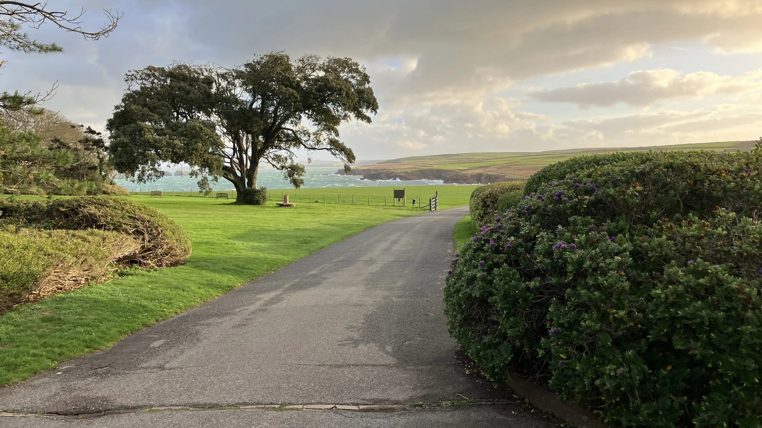
Path to the Sea – by Norman Fuggle
A gentle composition leading the eye from the path to the wind-tossed sea. The soft golden light brings warmth to the coastal landscape.
Could be improved: Crop a little from the tarmac foreground and give the distant sea a slight lift in contrast for depth.
Lesson learned: When a path leads to a horizon, make sure the destination feels alive.

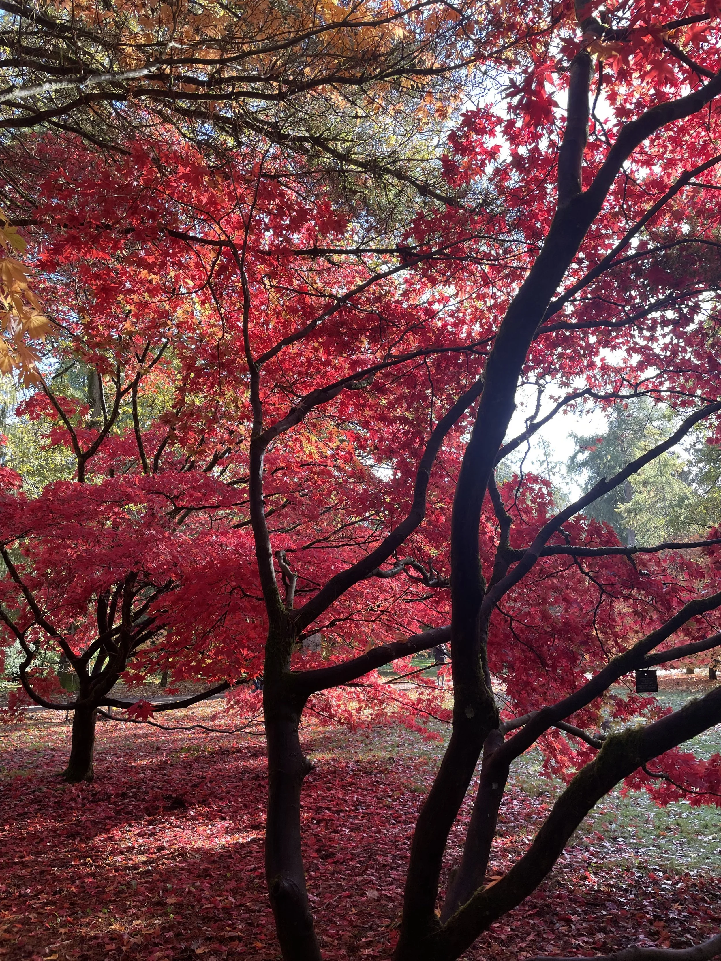
Autumn Fire – by Diana Ross
A glorious celebration of colour. The contrast between the dark branches and the scarlet leaves captures the richness of autumn.
Could be improved: A crop from the right would simplify the frame, and lifting the shadows would reveal more bark texture.
Lesson learned: Even when colour dominates, good tone still shapes the story.

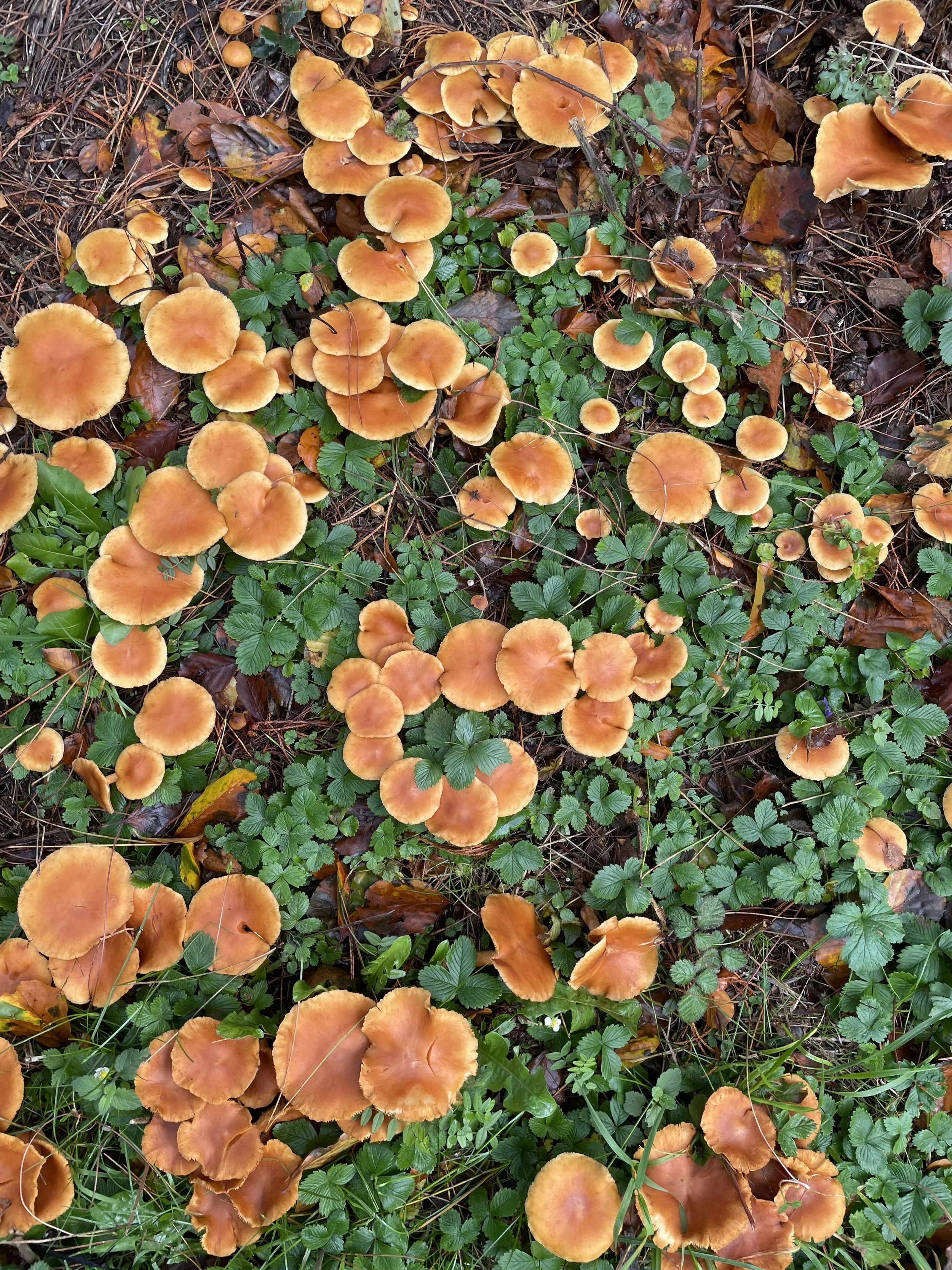
Fungi Carpet – by Diana Ross
An excellent natural pattern study — repetition, rhythm, and harmony. The warm orange caps and cool green leaves create beautiful contrast.
Could be improved: A subtle vignette or sharpening of the central group would focus the viewer’s eye more clearly.
Lesson learned: Nature’s chaos becomes art when you help the viewer see the pattern.

Resting Dog – by Vic Steadman
A lovely, characterful portrait. The light catches the texture of the fur beautifully, giving the image warmth and tenderness.
Could be improved: The brightest highlights on the head could be tamed slightly, and softening the background rug would concentrate attention on the face.
Lesson learned: In animal portraits, manage contrast carefully — emotion lives in the midtones.

Reeds and Shadows – by Vic Steadman
Powerful perspective and great use of texture. The towering reeds and the vanishing track create strong depth and movement.
Could be improved: Lighten the lane slightly to balance the weight of the reeds and reduce clarity in the distance to separate foreground and background.
Lesson learned: Tone controls depth — use light to pull the viewer into the scene.

Stourhead Stable Building – by Tim Ravenscroft
Initial Impression:
A fine study in texture and symmetry. The play of light across the stonework brings out a tactile sense of age and craft. The framing vines soften the austerity of the architecture beautifully.
Suggestions for Improvement:
Consider reducing overall contrast slightly so that the stone texture doesn’t overpower the composition. A small perspective correction could straighten the central door frame for even more balance.
Lesson Learned:
Texture tells the story of time — but restraint in contrast ensures it remains believable.

Temple of Apollo, Stourhead – by Tim Ravenscroft
Initial Impression:
Lovely use of framing through foliage. The composition feels intimate yet grand, with the temple emerging like a secret in the forest. The dappled light enhances the sense of depth and seclusion.
Suggestions for Improvement:
A very subtle crop from the top could reduce the dominance of the upper leaves while keeping the frame-within-a-frame effect. Some gentle dehaze in the mid-distance would bring out the temple detail even more clearly.
Lesson Learned:
Framing through foliage adds mystery — but balance the foreground weight so the subject still holds command.

Stourhead Pantheon – by Tim Ravenscroft
nitial Impression:
A beautiful landscape composition making fine use of autumn light. The Pantheon sits perfectly within its natural setting, framed by trees of varying tones and textures. Reflections on the water are delicate, balancing the weight of the structure above.
Suggestions for Improvement:
A slight lift in the shadowed areas on the left-hand side would provide more symmetry of tone and open the image. Alternatively, a gentle vignette could emphasise the central tree and Pantheon pairing.
Lesson Learned:
When structure meets landscape, harmony of tone unites them — use light to balance the natural and the man-made.

Stourhead Church and Bridge – by Tim Ravenscroft
Initial Impression:
Another well-observed scene — the church emerging quietly among autumn foliage. The balance of greens and golds gives a painterly feel reminiscent of Constable.
Suggestions for Improvement:
The sky feels a touch heavy compared to the luminous foreground. Lightening the clouds or reducing clarity would allow the midground church to draw more attention.
Lesson Learned:
In layered landscapes, adjust atmospheric contrast between planes to control where the eye rests.

Still Life with Flowers – by Vic Steadman
Initial Impression:
A quietly powerful monochrome still life. The strong directional light creates bold diagonals across the table, giving structure and drama to a domestic setting. The detail in the flowers and printed pages adds richness without clutter.
Suggestions for Improvement:
The bright highlights on the tabletop verge on clipping; a slight burn-in could preserve texture. A gentle vignette might also contain the eye within the central light patch.
Lesson Learned:
Everyday interiors can feel cinematic when shadows are composed with intention.

The Bridge and Pantheon – by Tim Ravenscroft
Initial Impression:
A classic composition beautifully executed. The double arc of bridge and temple creates an elegant rhythm, and the muted autumn palette feels timeless.
Suggestions for Improvement:
The dark area under the nearest tree could be brightened slightly to reveal more of the water’s edge and prevent visual heaviness. Alternatively, a light misting effect could soften transitions between the planes.
Lesson Learned:
Compositional echoes (bridge and temple) work best when light also guides the eye between them.