Basic Colour Theory — Seeing the World in Red, Green and Blue
As I look back over my last six months of monochrome photography to update my personal web portfolio, I find myself wondering whether I have developed a personal style. One of the first conclusions I’ve reached is that I am a contemporary rather than traditional mono photographer. I’m not trying to replicate the look of film and darkroom prints; I want to take full advantage of the digital colour image I start with — to create what I think of as modern black and white.
I set out to write about the difference between traditional (film and darkroom) and contemporary (digital) black-and-white photography, but soon realised that I first needed to explain how our cameras “see” colour. Colour theory can become dreadfully technical, so I’ll keep it simple and use the diagram below to illustrate the basics.

Basic Colour Theory – three overlapping circles show how red, green and blue light combine to form cyan, magenta, yellow, and white. Desaturating removes colour, while digital editing allows each channel to be adjusted separately to shape modern black-and-white photographs.
Each of the three overlapping circles represents one of the primary colours of light — Red, Green, and Blue — all at maximum intensity. Where they overlap, we see the secondary colours cyan, magenta, and yellow; where all three overlap, we see white.
White light is actually a continuous spectrum of wavelengths, but both artists and scientists simplify it by dividing it into these three components. Any colour we perceive can be created by varying the proportions and brightness of red, green, and blue — whether by mixing pigments on a palette or combining pixels on a screen.
Our digital cameras work in exactly the same way. The sensor itself only measures light intensity, but a filter array in front of it separates the incoming light into red, green, and blue channels. Each pixel records the brightness of one of those colours at its location in the scene — shown in the left-hand diagram above.
If we remove all colour (the centre diagram), each circle becomes the same shade of grey because all three channels had equal intensity. This is how the black-and-white film photographer saw the world: a red apple, a green leaf, and a blue ball would all appear as the same mid-grey if lit equally. By the time the film reached the darkroom, all colour information was gone. Contrast between tones had to be created using filters, paper grades, and careful dodging and burning. The artistry lay equally with both photographer and printer — which is why they were often the same person.
In the digital age (right-hand diagram), the computer receives a full colour file. We can now decide how each channel contributes to the black-and-white conversion, independently adjusting the red, green, and blue components. This gives the modern photographer the ability to separate tones and textures that film could only merge. The contemporary black-and-white image can hold far greater tonal variation and subtle detail than was ever possible in the traditional darkroom.
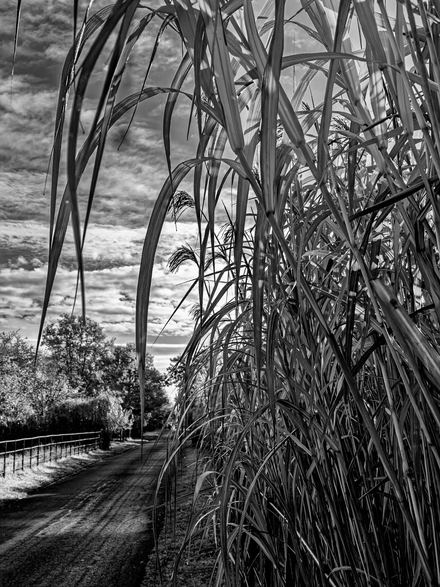
This image illustrates what I mean by modern black-and-white. It began as a full-colour digital file, then was converted using selective control of the red, green, and blue channels to separate tones within the vegetation. The result reveals detail and contrast that would have been almost impossible to achieve in a traditional darkroom print. The combination of deep shadow, fine highlight recovery, and subtle midtone gradation shows how digital processing allows us to reinterpret rather than merely remove colour — extending the expressive range of monochrome photography.