
Tim Ravenscroft – Palladian Bridge (autumn landscape)
CC: A beautifully balanced landscape showing depth, colour harmony, and texture. The framing through the autumn foliage enhances perspective.
Lesson: Wait for the light — early morning or post-rain glow can lift greens and golds and add depth to a familiar scene.
Sue Warren – Button collection
CC: Excellent use of pattern, colour, and texture. The variety keeps the viewer exploring the frame. A little more even lighting could reduce shiny highlights.
Lesson: Everyday objects can become art — think about texture, repetition, and how small details catch light.
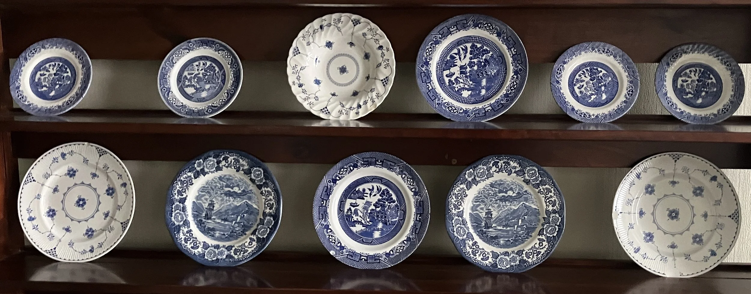
Norman – Blue-and-white plates
CC: Strong symmetrical composition with clear rhythm across the frame. Slight camera tilt can be corrected in post for a truly formal presentation.
Lesson: When photographing collections, symmetry and alignment are key to conveying order and aesthetic appeal.
Vic Steadman – Fantasy landscape (AI or composited scene)
CC: Dramatic lighting and mood; the contrast between the scorched foreground and distant city creates tension. Sky detail is excellent.
Lesson: Mood comes from tonal control — don’t fear dark shadows if they enhance atmosphere.
Diana Ross – Street scene, Bath benches
CC: Simple but effective urban composition. The red circular benches lead the eye through the frame and contrast well with neutral shopfronts.
Lesson: Colour can become your subject — look for repeating shapes or hues in public spaces.
Robin Parry – Toilet rolls in a circle
CC: A witty and graphic study in form and repetition. Shadows add interest but could be softened by adjusting light angle.
Lesson: Minimalist compositions can be strong when geometry, tone, and humour combine.
💡 Overall Learning Points
Everyday subjects often make the strongest images when seen from a fresh perspective.
Repetition and geometry remain a rich source of creative design.
Even light enhances pattern; directional light enhances mood — knowing which you want is key.
Don’t overlook post-processing corrections for symmetry and balance.
Simple colour contrasts (red/grey, blue/white) can define composition as effectively as leading lines.