Composition
We talk a lot about composition when we critique photos at our club meetings so I thought I would draw up some hints and tips. Photographers often talk about “rules of composition” but there are no rules and they sometimes contradict each other.
What is the subject/what is the story?
The subject of your photo should be immediately recognisable. Do not include anything in the shot that is not necessary. This means you should use the optical zoom on your camera, or your feet, to get in closer in order to fill the frame with the bits that are important and cut out distractions. By all means crop the image in post processing to assist and be wary of “throwing away pixels too early” by using digital zooming (e.g. squeezing the screen on a mobile phone) as this reduces quality by spreading fewer pixels over a larger area.
Less is more, simplify your image by leaving out anything that is not necessary. You can take this further by simplifying the colour palate (going Black and White, for example).

This image lacks a definate subject, is it the trees or the buildings why do I want to look at either?
Landscape or Portrait?
Think about how you want to present your photos; about how a set of related images is often a stronger form of presentation. Therefore try to use both aspect ratios in your photography to give you more flexibility when you make your final selection as all landscape or all portrait groups tie better together.
Vary Your Viewpoint
We are used to viewing the world from head height so photos taken from other viewpoints often stand out more. Get down low or up high, get off the path. Children or pets, for example, look better when photographed from their eye level rather than looking down on them.
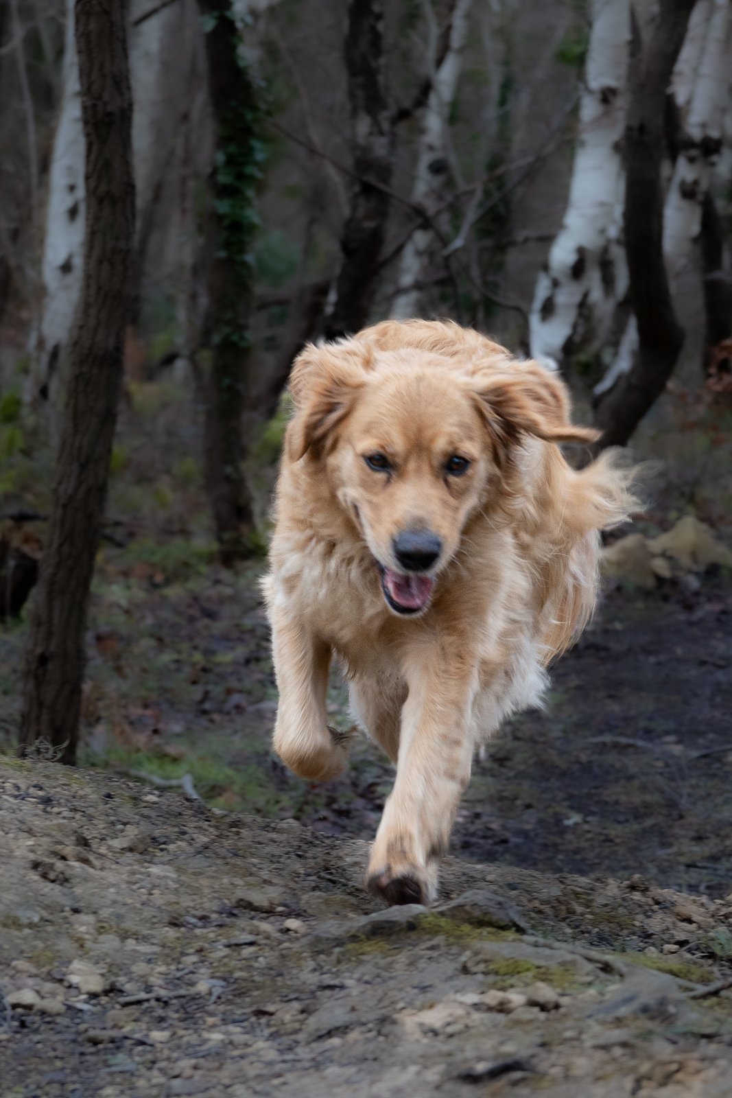
Taken lying down on the ground as the dog runs uphill. The lens is on the line of the dogs eyes. Simplified composition leaves no doubt the dog is the subject,
Do Not Cut Things Off
Your photo has to have edges but those edges should not cut off important parts of your subject unless it is deliberate. We are used to head and shoulder portraits, for example but figures ending at their knees or with the tops of their heads cut off look unusual.
Ideally, your subject should be given “room to breath” with space all around it. Your viewer should not have to imagine bits that have been cut off.
The Rule of Thirds
Most cameras have an overlay grid with the rule of thirds. Switch it on; it helps you place important things at the right intersection and assists in keeping horizontals level and verticals vertical.

This photo deliberately breaks the rule of thirds by putting the horizon in the middle. It works none the less because the lines in the clouds and the grass draw the eye in and reinforce the point that the subject is the trees themselves. The subject is actually the building remains in those woods but that is not clear in the photo.
Look For Frames
Archways, doors, tree trunks can be used to hold the viewers eye on your subject.
Keep it Straight
Sloping horizons, tilting building verticals etc all detract from a successful image. Yes you can create dramatic effect by tilting things but it needs to be dramatically so if it is not to look like a mistake!
Leading lines
Lines lead the eye to your subject and hold it in place.