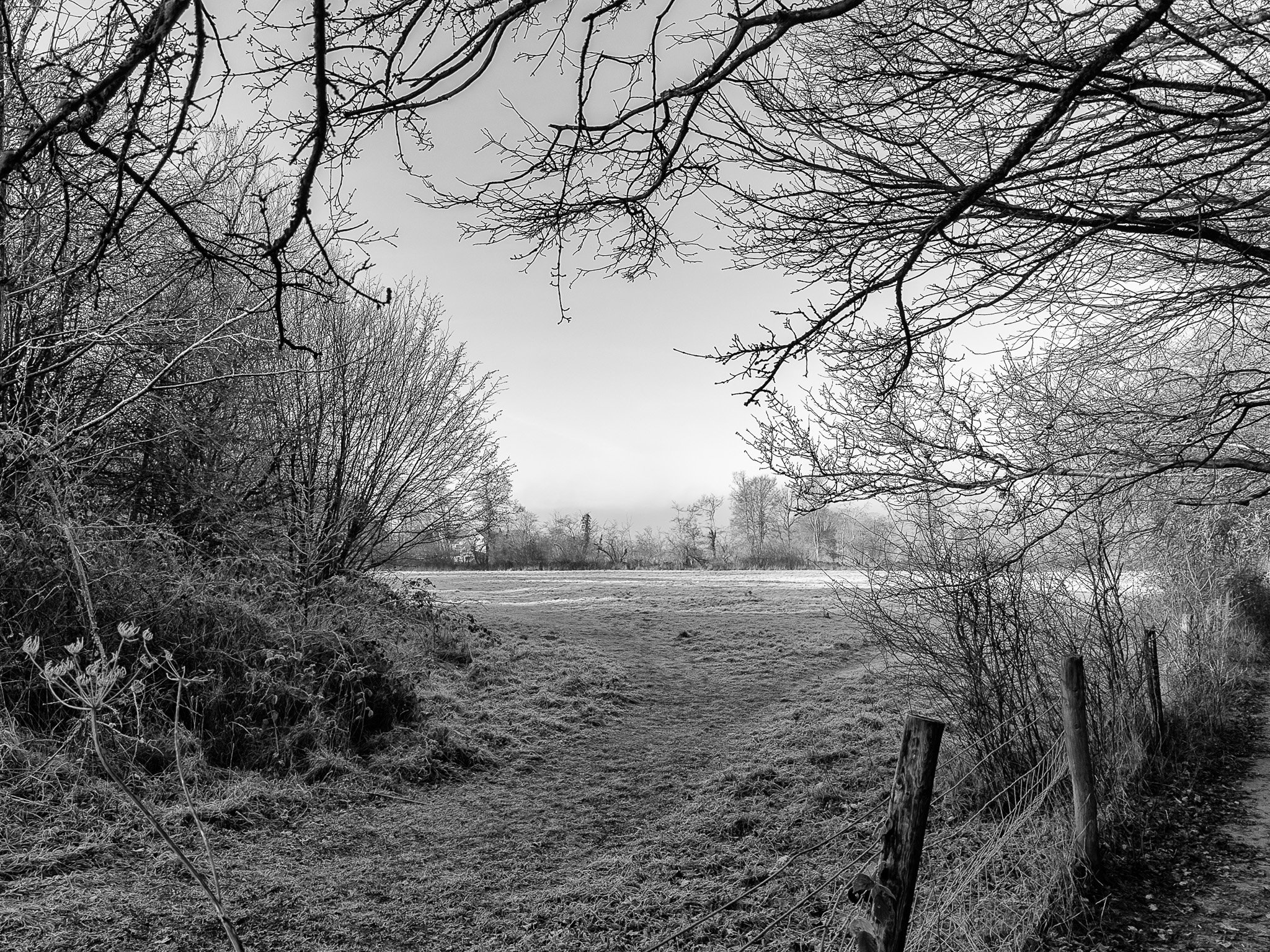
This latest set shows a strong and consistent engagement with form, structure and abstraction, particularly through the use of symmetry, repetition and texture in monochrome. The abstract images by Tim Ravenscroft demonstrate confident control of composition and tonal balance, with recurring themes of geometry and surface detail handled thoughtfully. Vic Steadman’s winter landscape provides a quieter counterpoint, using natural framing and atmosphere to create depth and a clear sense of place. Across the batch, compositions are generally well considered, with only minor refinements suggested around edge control, tonal emphasis and balance.

Tim Ravenscroft – Symmetrical Wooden Panels with Metal Fixings
Description
A monochrome abstract showing two wooden panels divided by a central seam, each punctuated by a circular metal fixing, emphasising symmetry, texture and repetition.
Good Points
• Strong bilateral symmetry gives the image immediate impact and clarity
• The pairing of circular metal forms against linear wood grain works very well visually
• Monochrome treatment highlights texture and tonal differences effectively
• Clean, uncluttered framing keeps the composition focused and deliberate
Areas to Improve
• The central vertical gap is visually dominant; slight tonal control could reduce its pull
• Very small alignment differences become noticeable in symmetrical images—worth checking precision
• Consider whether a slightly tighter crop would strengthen the graphic quality further
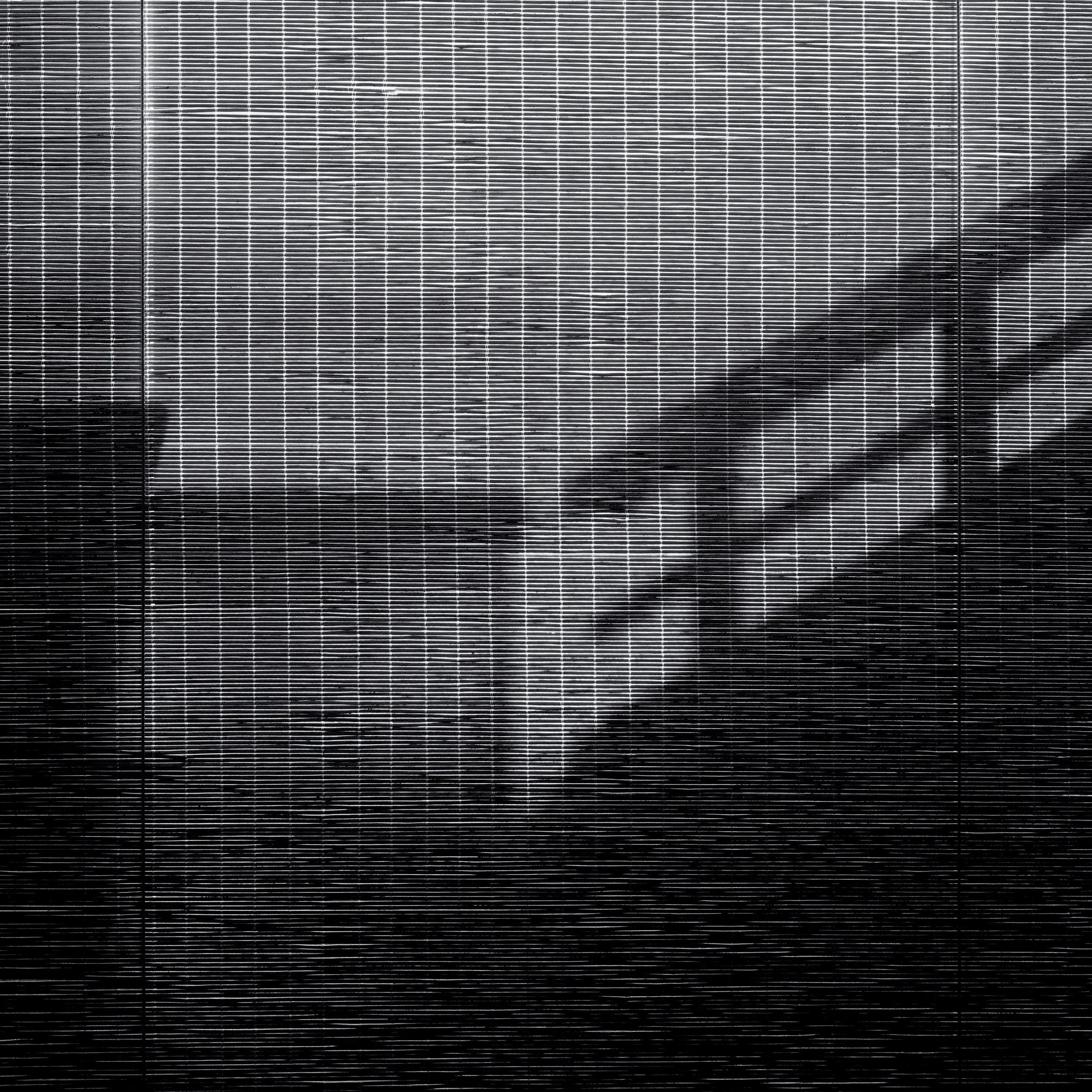
Tim Ravenscroft – Screen and Shadow Abstraction
Description
A high-contrast monochrome abstract where a fine grid or screen overlays a softer underlying scene, creating layered patterns of line, tone and shadow.
Good Points
• Strong graphic impact from the dense horizontal and vertical line structure
• Effective use of contrast, with lighter upper tones transitioning into darker areas below
• The interaction between the rigid grid and the softer shadowed forms adds visual tension
• Monochrome treatment suits the subject, emphasising pattern and rhythm
Areas to Improve
• The brightest central area draws the eye quickly; subtle tonal moderation could improve balance
• The underlying subject remains ambiguous, which may divide viewers—either lean into this fully or hint slightly more
• Consider whether a small crop from the bottom could reduce visual weight and tighten the composition
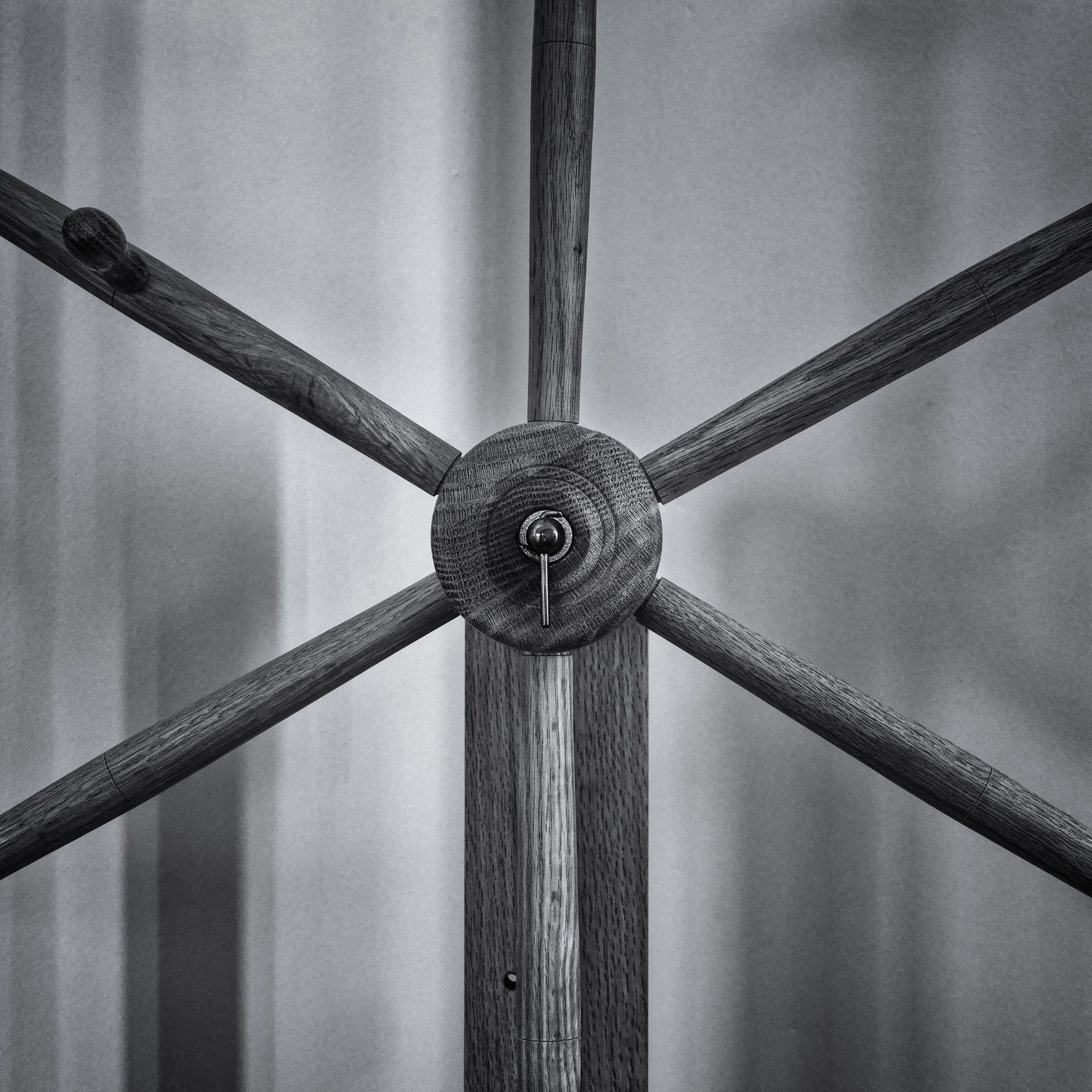
Tim Ravenscroft – Radial Wooden Structure
Description
A monochrome abstract image centred on a circular wooden hub with radiating arms, creating a strong sense of symmetry and balance against a softly textured background.
Good Points
• Excellent use of symmetry, with the central circle acting as a strong visual anchor
• The repetition of lines radiating outward creates rhythm and structural clarity
• Monochrome treatment suits the subject well, emphasising form, grain and texture
• Subtle background tones prevent distraction and help the structure stand out
Areas to Improve
• The central fixing draws the eye very strongly; slight tonal control could soften its dominance
• A touch more separation between the wooden arms and background might enhance depth
• Consider whether perfect symmetry is the strongest choice, or if a slight shift could introduce tension
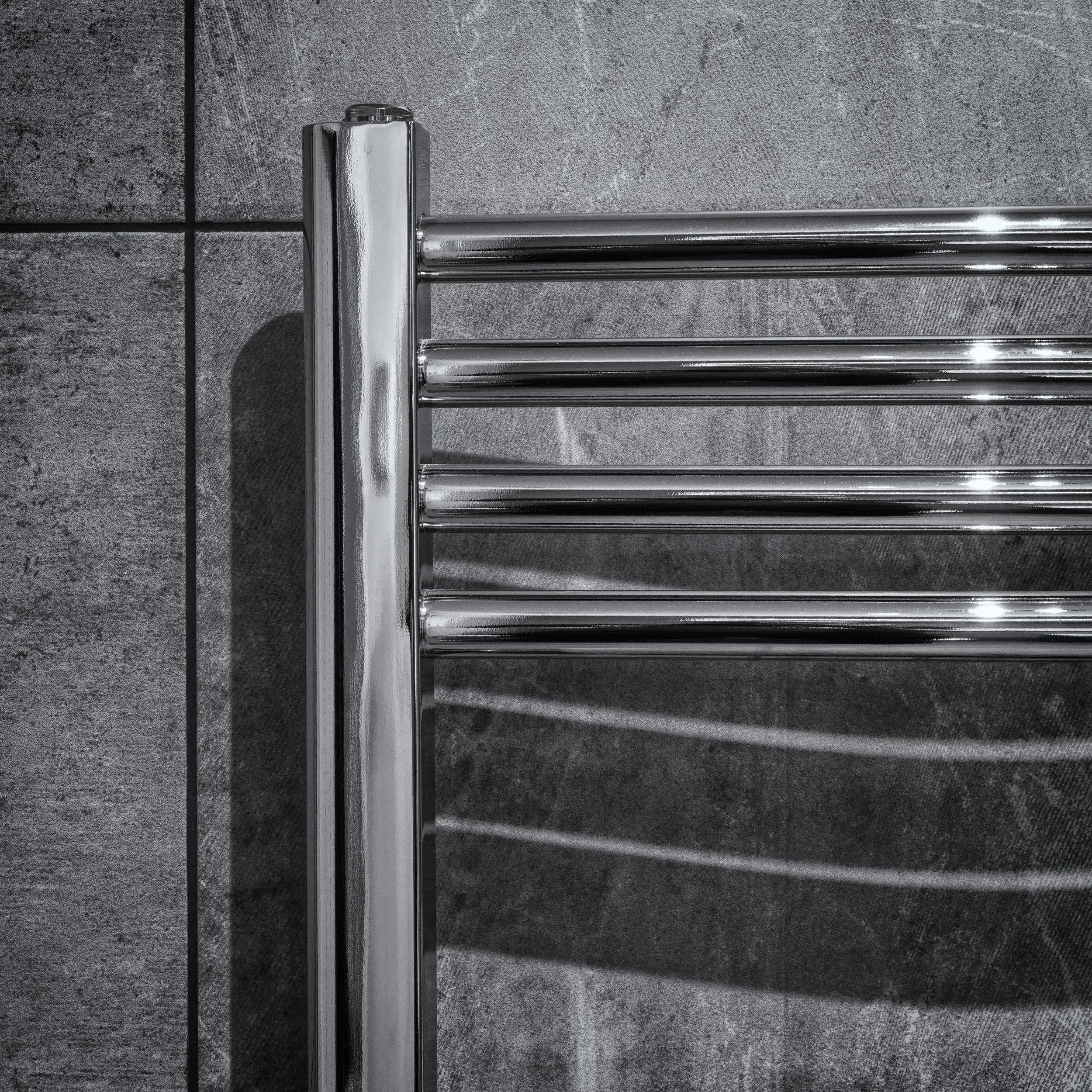
Tim Ravenscroft – Geometric Abstract (Chrome Rail and Tile)
Description
A monochrome abstract focusing on the intersection of a chrome towel rail against a tiled wall, emphasising line, reflection and surface texture.
Good Points
• Strong graphic composition built from clean verticals and horizontals
• Effective use of reflection and shadow to add depth and complexity
• The contrast between polished chrome and matte tile works very well in monochrome
• Tight framing keeps the image purposeful and controlled
Areas to Improve
• Bright highlights on the chrome draw the eye quickly; very subtle highlight control could improve balance
• The left-hand edge feels visually heavier than the right — a slight crop or tonal adjustment might refine the balance
• Consider whether reducing background texture slightly would allow the structure to dominate more clearly
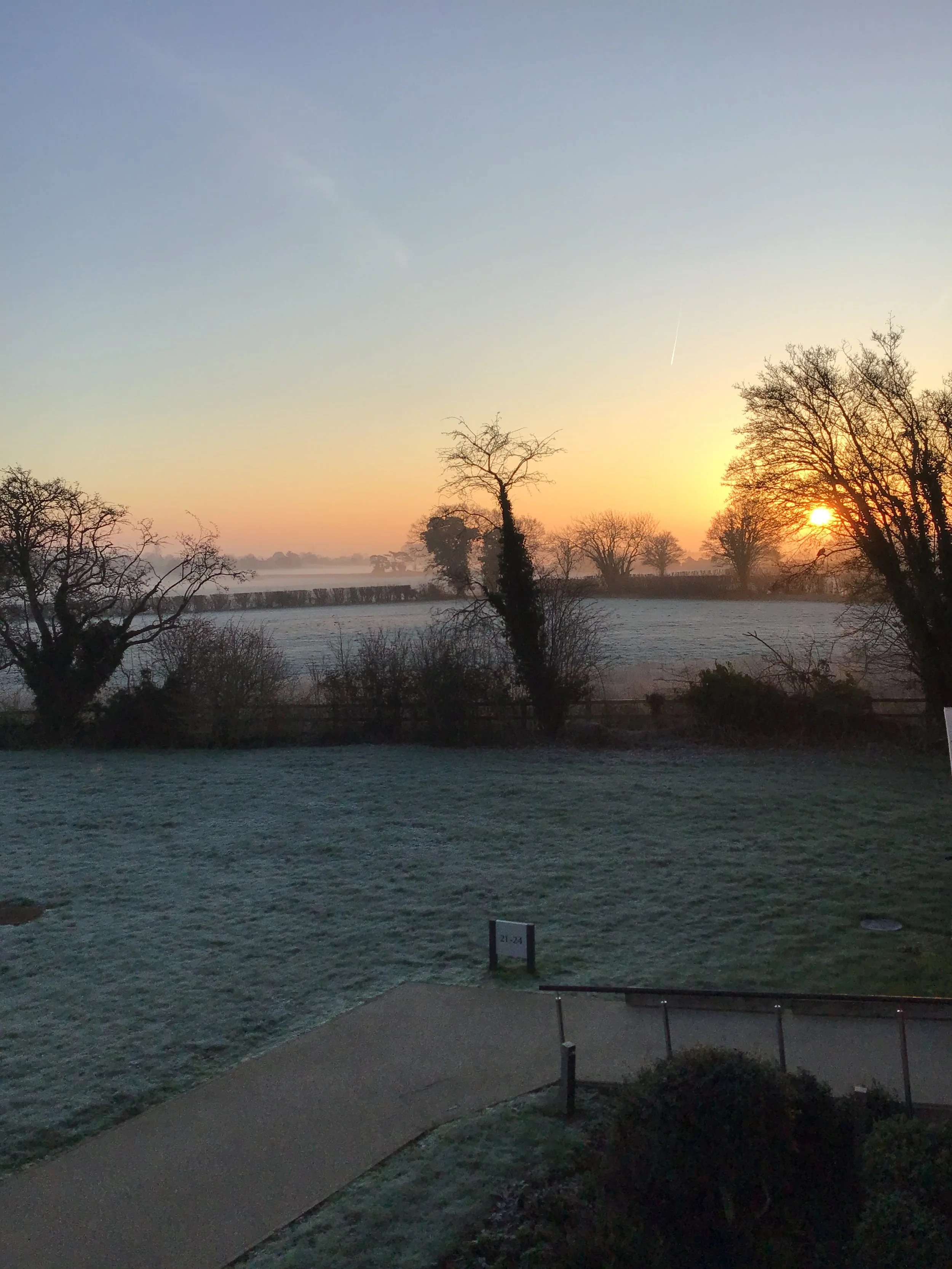
Patricia Buckland – Frosty Sunrise Over Fields
Description
A tranquil winter scene showing frost-covered grass and fields under a soft sunrise, with trees silhouetted against mist and warm early light.
Good Points
• Strong sense of atmosphere created by the mist and low winter sun
• Pleasing colour gradient in the sky, shifting gently from warm to cool tones
• Natural framing from the trees helps anchor the scene
• The frost adds texture and reinforces the early-morning mood
Areas to Improve
• The foreground path and hard edges at the bottom of the frame slightly weaken the immersion; a tighter crop could strengthen the composition
• The central area lacks a clear focal point once the eye moves past the sun
• Consider a lower shooting position or repositioning to simplify foreground elements
Vic Steadman – Frosty Field with Framing Trees
Description
A monochrome winter landscape showing a frost-covered field viewed through overhanging and side-framing trees, with a soft, misty distance creating a quiet, open centre.
Good Points
• Strong natural framing from the trees gives the image structure and containment
• The open central space contrasts nicely with the denser foreground and edges
• Frost and mist combine to create a calm, subdued winter atmosphere
• Good sense of depth, with foreground texture leading the eye into the distance
Areas to Improve
• The right-hand edge (fence and path) competes slightly with the central opening and draws the eye outward
• The top branches are visually busy; a small crop from the top could simplify the frame
• The tonal range is very even—introducing a little more separation between foreground and mid-ground might add clarity