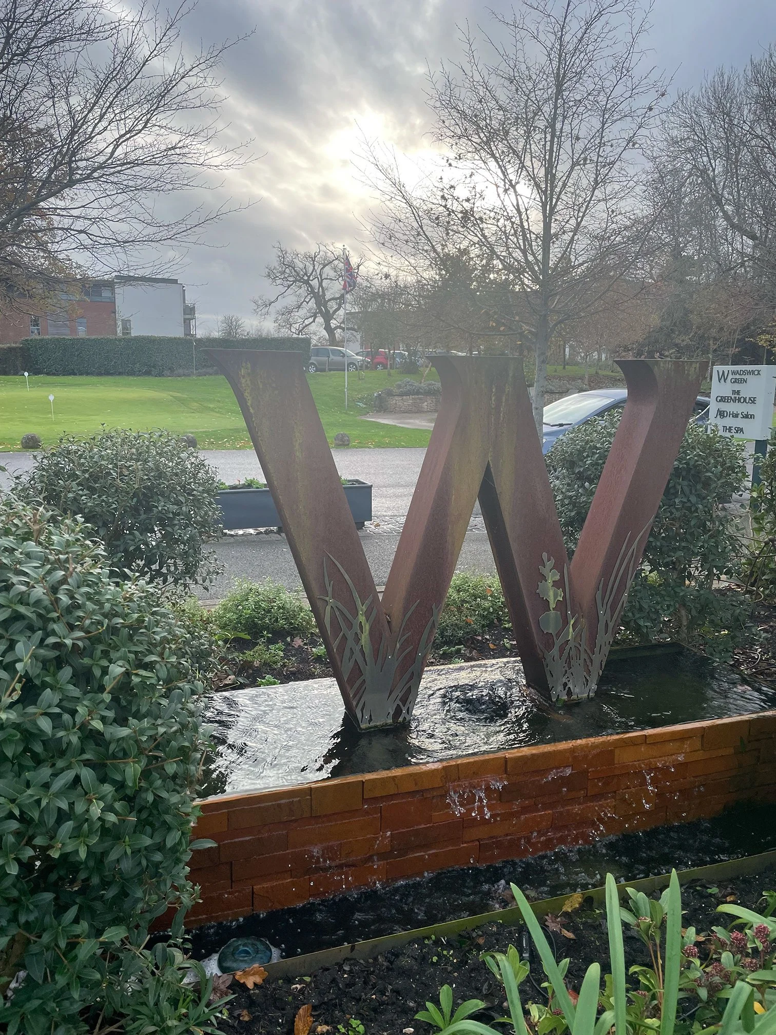
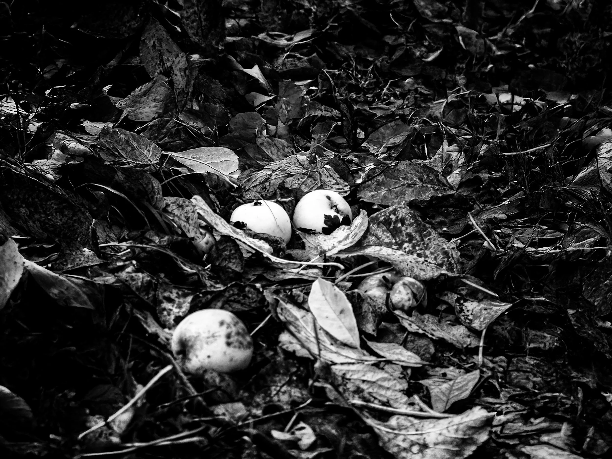
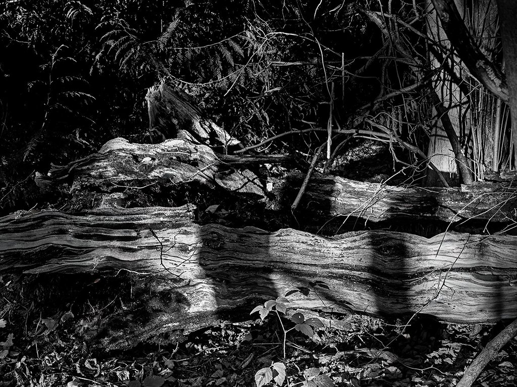
A smaller set of images this week, but full of variety and thoughtful seeing: Tim captured a dramatic seascape with beautifully timed shafts of light breaking through heavy cloud; Vic contributed an intriguing diptych exploring two very different monochrome interpretations of a winter oak, alongside a delicate study of woodland fungi and a richly textured fallen trunk; and Diana offered a cheerful seasonal view of the sculptural “W” on the green under a glowing winter sky. Together they show how even familiar subjects can reward patience, experimentation, and close observation.
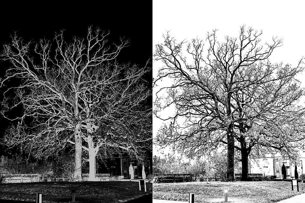
Vic Steadman – “Two Winters”
Critique:
An engaging diptych comparing a high-key negative interpretation with a straight monochrome rendering. The strong graphic quality on the left is a bold contrast to the more naturalistic right-hand version. Matching the crop lines and aligning key structural points (e.g., trunk base) would strengthen the dialogue between the two images.
Lesson learned:
Diptychs work best when the two halves speak to each other in scale, structure, and alignment—technical consistency supports artistic contrast.
Diana Ross – “Winter W”
Critique:
A pleasant documentary shot of the sculptural W feature with a softly glowing winter sky behind. The photograph benefits from atmospheric backlighting but the scene is visually busy—multiple elements (shrubs, sign, planter, road) compete for attention. A slight change in angle or a lower viewpoint could declutter the frame.
Lesson learned:
When photographing recognisable features, small changes in position can dramatically simplify the composition and strengthen the subject.
Tim Ravenscroft – “Heaven’s Curtain”
Critique:
A beautifully judged seascape with dramatic light breaking through a textured sky. The shafts of light feel natural and powerful, and the exposure holds detail in both highlights and shadows. The horizon placement is spot-on. Consider slightly opening the mid-tones in the water to let the rays connect more clearly with the sea surface.
Lesson learned:
When photographing dramatic skies, wait for the moment when the light interacts with the land or sea—this gives structure and emotional weight to the scene.
Vic Steadman – “Forest Orbs”
Critique:
The fungi sit well within the textured leaf litter, and the triangular arrangement of the three brightest forms creates a natural focal point. The monochrome processing gives the scene a sombre, documentary feel. Lifting the deepest shadows slightly would increase separation and visual clarity without weakening the mood.
Lesson learned:
In low-key woodland monochrome, a little shadow detail goes a long way—clarity improves while atmosphere is preserved.
Vic Steadman – “Striations”
Critique:
A rich study of the fallen trunk with excellent texture and tonal structure. The linear grain acts almost like contour lines, pulling the viewer through the image. The surrounding branches add depth but may slightly distract; a gentle vignette or selective darkening could help re-centre attention on the log.
Lesson learned:
Texture-based compositions are strongest when the primary surface clearly dominates—use light and tone to guide the eye back to what matters.
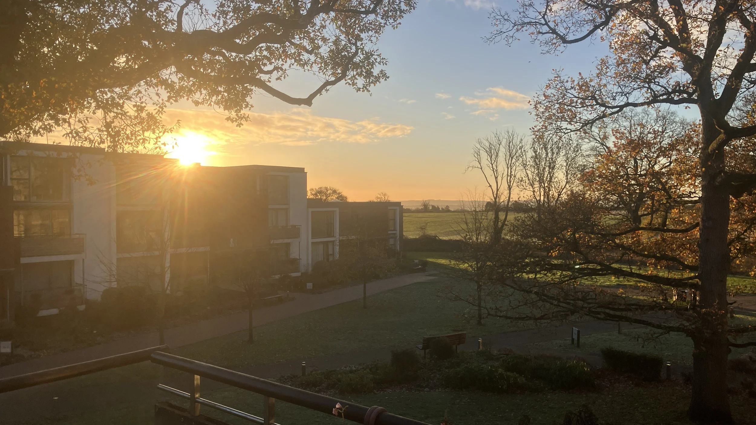
Norman - Sunrise Over Wadswick Green
A beautifully observed early-morning scene with warm golden light spilling across the buildings and grounds. The sunburst is handled well, and the contrast between the silhouetted oak branches and the glowing horizon gives the image a strong sense of depth. The right-hand tree anchors the frame nicely, while the distant fields add space and calm. The exposure is slightly pushed by the strong backlight, leaving the buildings a little muted, but that also helps preserve the atmosphere of a cold, misty morning.
Lesson learned: Shooting into the sun can create powerful atmosphere, but it helps to experiment with small shifts in position or slight exposure adjustments to balance flare, shadow detail, and the overall mood.