Untouched Review 23 Jan
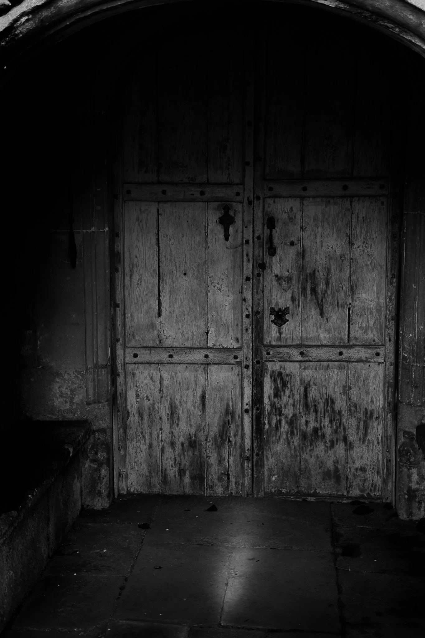

Description
A heavy, weathered wooden door set within a stone arch, emerging from deep shadow. The image is dominated by darkness, with the door becoming a quiet but immovable focal point, suggesting exclusion, denial, or an ending rather than an invitation.
Good points
Strong atmosphere and mood, with the darkness doing most of the narrative work. The texture in the wood and stone is well held, giving tactile interest without breaking the sombre tone. The central placement reinforces the idea of finality and obstruction, and the restrained tonal palette suits the subject well.
Possible Improvements
There is very little tonal separation between the surrounding darkness and parts of the door, which slightly flattens the composition. A subtle lift in midtones on the door alone might help it assert itself more clearly without weakening the overall mood.
Description
A small circular leaded window set deep within a stone wall, with soft, diffused light filtering through the glass. The window appears partially swallowed by darkness, giving a sense of enclosure and isolation.
Good points
Excellent use of negative space, with the window placed off-centre to heighten tension. The contrast between the geometric lead lines and the organic stone textures is visually engaging. The light feels fragile and distant, reinforcing a sense of separation from the outside world.
Possible Improvements
The darkest areas occupy a large proportion of the frame and may overpower the window slightly. Introducing a little more tonal detail in the stonework closest to the window could strengthen spatial context while keeping the overall sense of confinement.
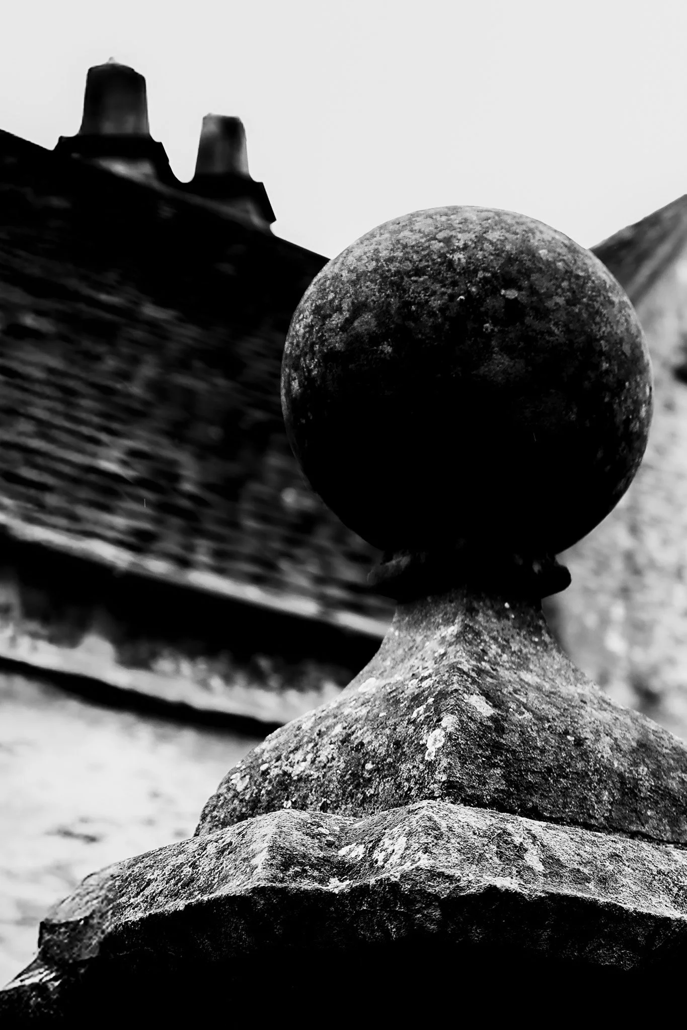
Description
A stone finial dominates the foreground, set against blurred rooftops and chimneys. The spherical form reads almost abstractly, standing in stark contrast to the angular architectural elements behind it.
Good points
Strong foreground emphasis and confident use of shallow depth of field. The sphere works well as a dominant form, creating ambiguity of scale and purpose. The tonal contrast between the dark stone and pale sky adds graphic strength, and the composition feels intentional and assertive.
Possible Improvements
The highlights in the sky are very bright, drawing attention away from the sphere. Slightly reducing their dominance could help keep the viewer’s focus anchored on the primary form without losing the stark, high-contrast aesthetic.